Joe Maffa's Portfolio
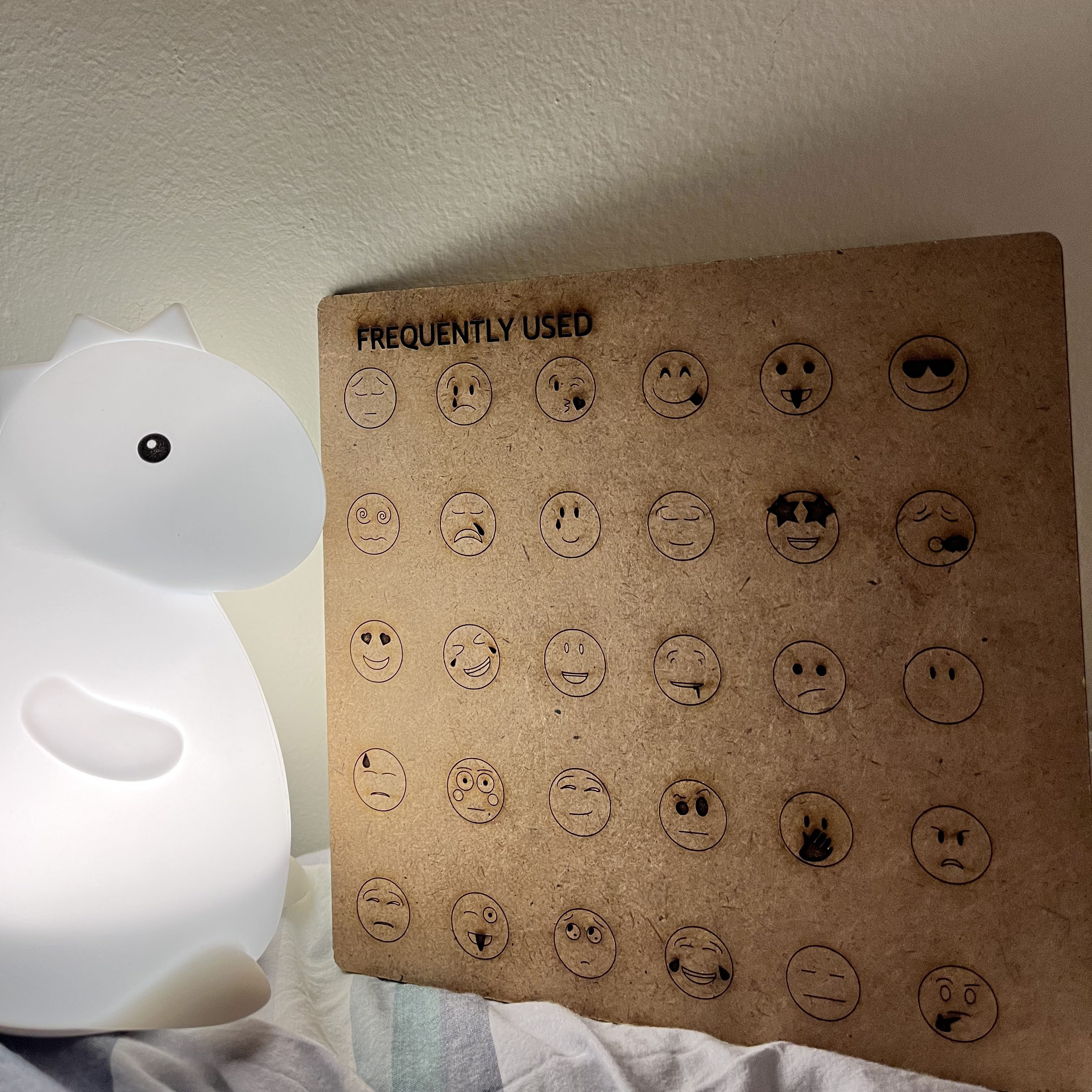
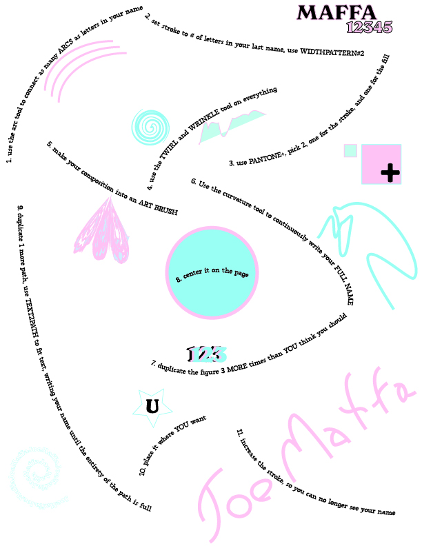
Project 1: Cutting Line — Frequently Used Emojis
In this project, I wanted to explore the ways that my most frequently used Emojis represented my
current mood and artistic output. Much of the time spent designing my project was learning how to
manipulate the Arc tool and using transformations to recreate a suite of emotion encapsulating emojis.
As a future exploration, I'd love to warp my emojis in order to add more personal flair, and resize
the board to reflect the size of my phone. Critiquing my work and the work of others helped me appreciate
the impact of tactility, and a more analogous experience to the use of a phone would help elicit this feeling.
Additionally, I may try to work with acryllic to translate the feeling of glass. As points of improvement,
I will try to reduce scorch marks by increasing the speed or decreasing the power of raster engravings, and I
will try to utilize the anchor point tool on Illustrator.
WIP: Project 2: Color As Medium — The Notion of Myself
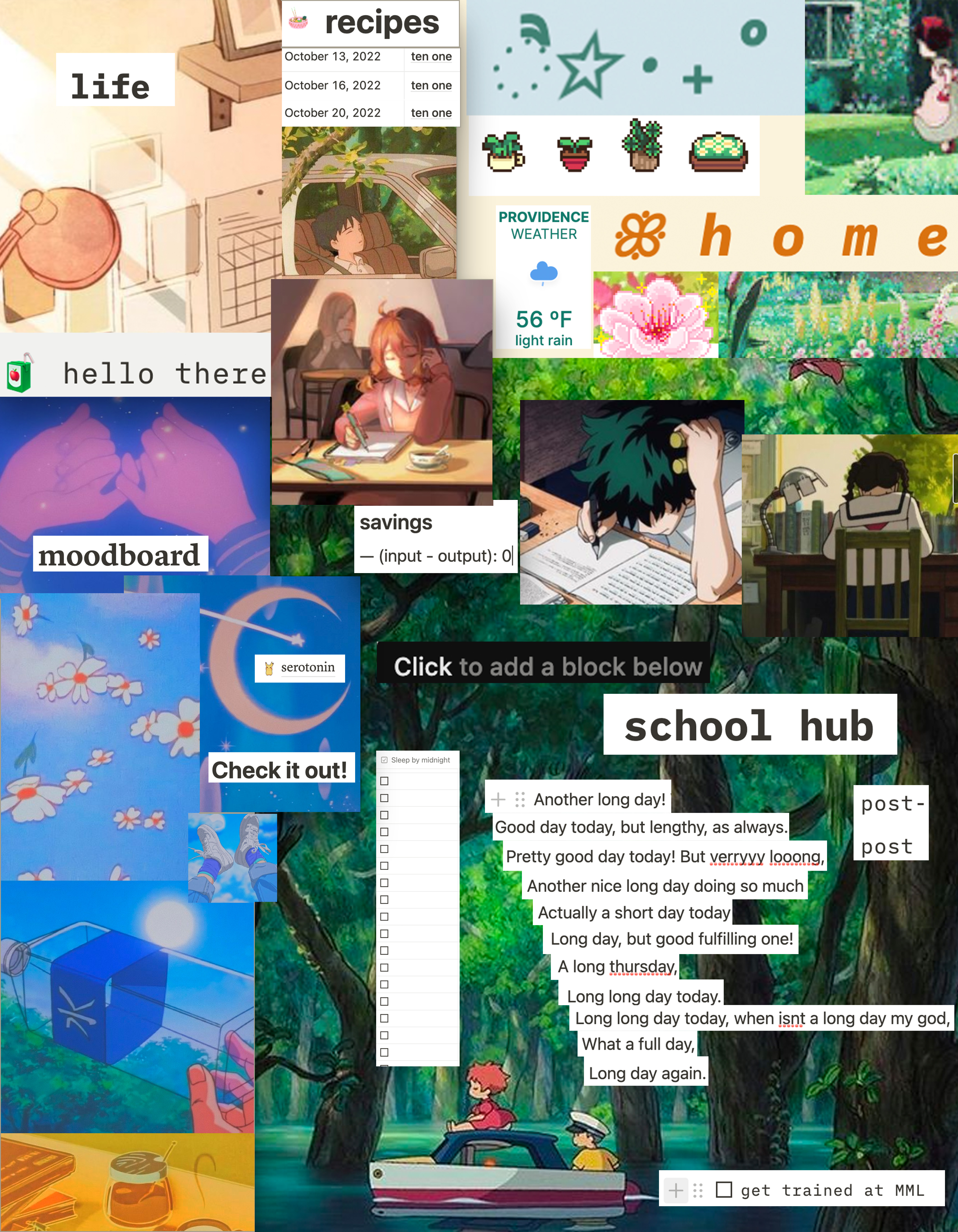
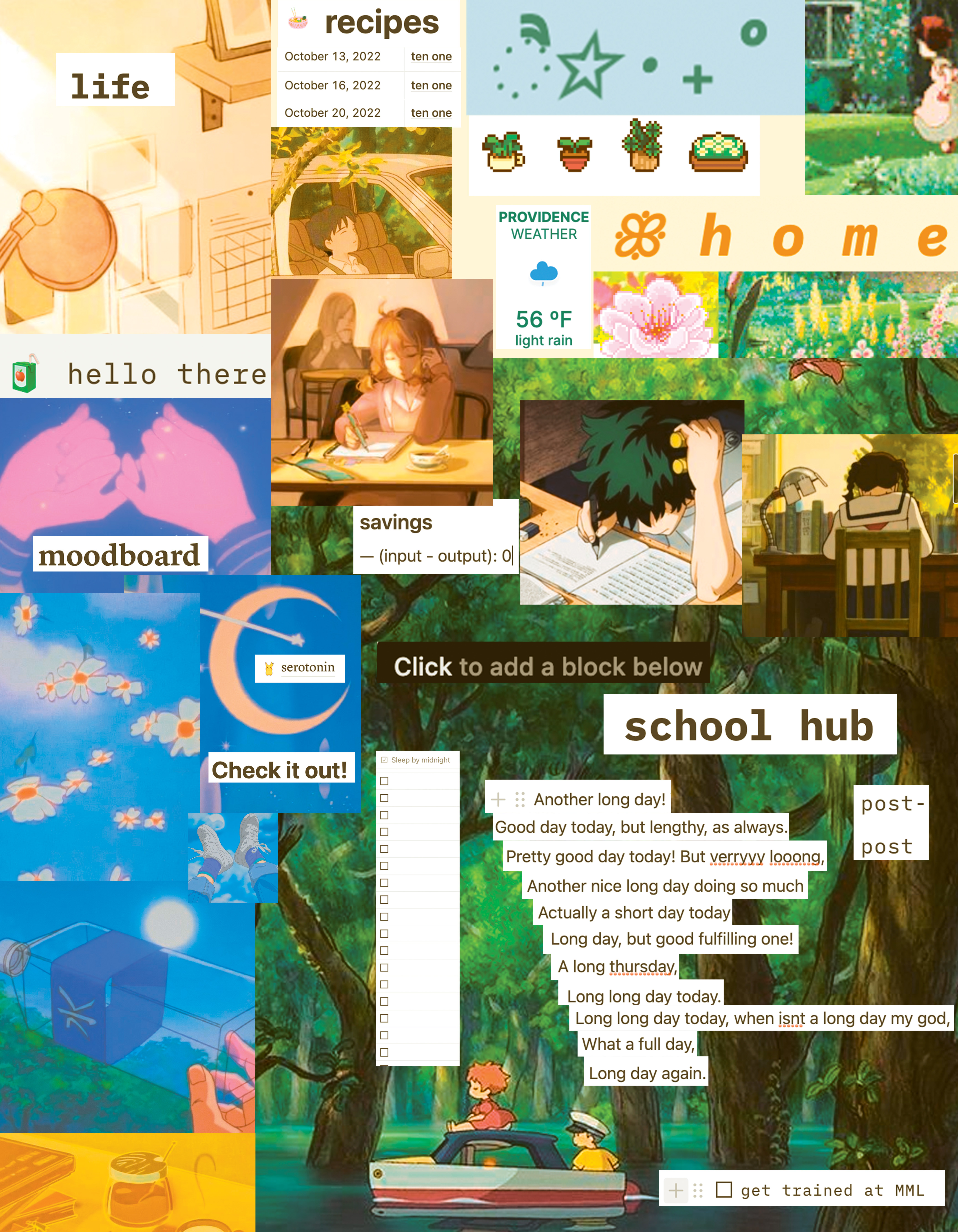
In this project, I wanted to explore the ways in which my Notion—a planning and journaling app—is embodying my
level of burnout. I have noticed that over the month of October, my journals and mood have been a lot more tired,
but my Notion remains equally as peaceful and "aesthetic." Through this collage, I wanted to juxtapose some of my
frustrations embodied in the weather, my lack of sleep, and my exhausted journaling (among other things) against
the colors of my planner. For the most part I am quite pleased with the way this came out, but I would have wished
that I could make it a little bit less linear and segmented, particularly in the section with my journal. Further,
I am interested about how I could keep this as digital art and animate it. Many of the images are screenshots of gifs
in my Notion, and I think animating the composition could contribute to the living nature of my work and my mood.
I also would try to add a border to my printed work if I could redo it because I think the framing works nicely against
the ultra saturated composition. On the left is the RGB version, and on the right is the CMYK version. The main difference
between the two is that the CMYK version brings out the yellow tones more heavily. The RGB version also has drop
shadow in the Life and Moodboard sections.
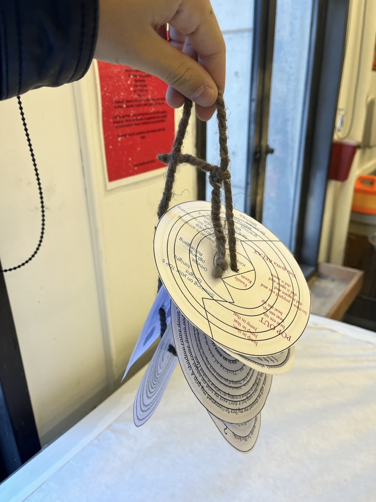
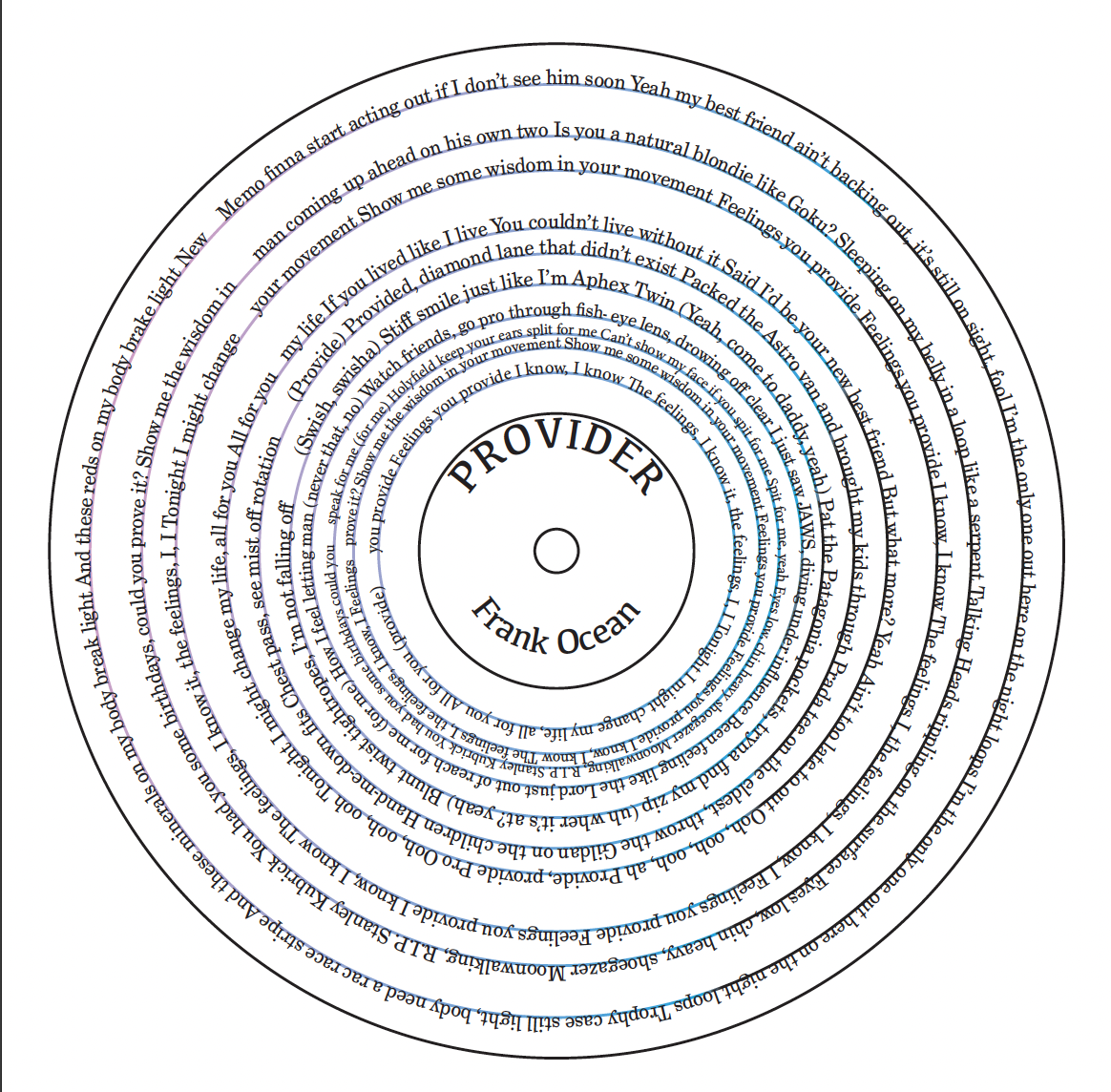
Project 3: Steal This Book — Recording Records
In this project, I experimented with the ways in which text could be displayed in the form of a book. I tried to
stray from the prompt in making a zine, and instead made a bound set of "records". Each of the records represented
a song with the lyrics covering the face of it. In many ways, I am proud of the idea that I imagined, but I admittedly
did not put out a product I am completely satisfied with. With the physical ring of records, I wish I could've bound them
with a plastic material, something akin to the vinyl of a real record. I also wish I had made the records double sided in a
more sensical way, so that they could have A and B sides. Finally, with the actual works of art, I would've liked to experiment
more with the types of font and decoration of the records as opposed to simply changing the way that the words were arranged.
Still, I see these as points of improvement, as opposed to places to be disappointed, and I am excited to see how I would
try to iterate on this project in the future
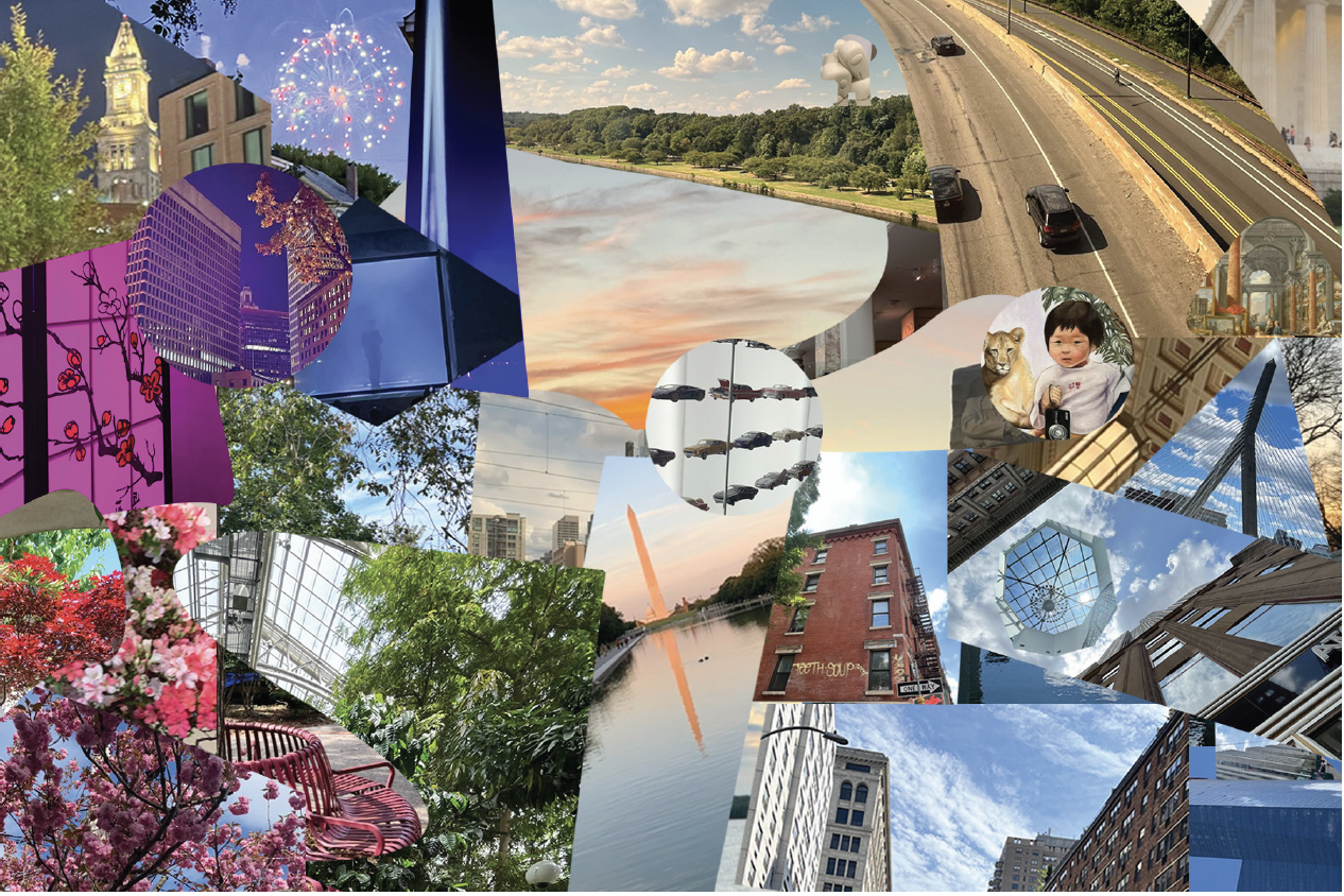
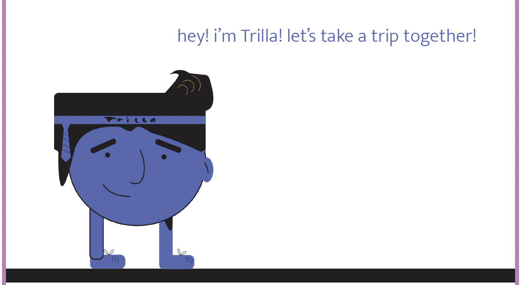
Final Project: gallery walk with Trilla
For my final project, I wanted to display some of the techniques by which I learned to manipulate digital media over
the course of this class. In particular, I wanted to first create a collage that could be used as a piece of art. The
method through which I explored this art was with a character I imagined in Illustrator named Trilla who is modeled in the
style of flat graphic design. The narrative explores Trilla walking through the gallery as he and the work both fall under
the digital spell of the gallery. In doing so, they undergo different manipulations, including bitmapping, RGB separating,
droplet manipulation, text glitching, and audio glitching. By the end of his journey, Trilla no longer seems to be as positive
as he is when he enters. This was a great exploration of the talents I picked up during this class, and I could see myself continuing
this series with all sorts of different types of photo manipulation.
Pair Exercises
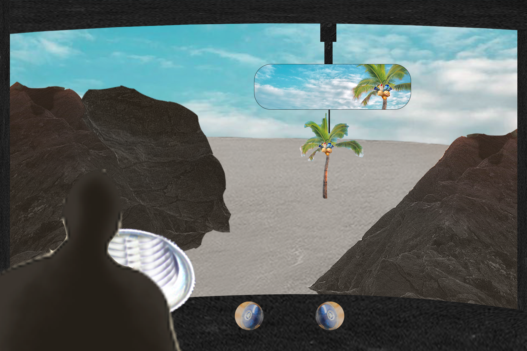
Photoshop: Revisiting
'Coconutty, Oppressive heat softened by fans, Zen—focused zoning out'
Using Joyce Li's images, I recreated a significant place to me: My car. I tried to build a landscape of a place that
is simultaneously dreary, and also gives an air of relaxation. I was particularly excited by my use of the layer mask
tool for the mirror. If I could improve my work, I would try to amplify the aspects of heat by overlaying a wavey filter.
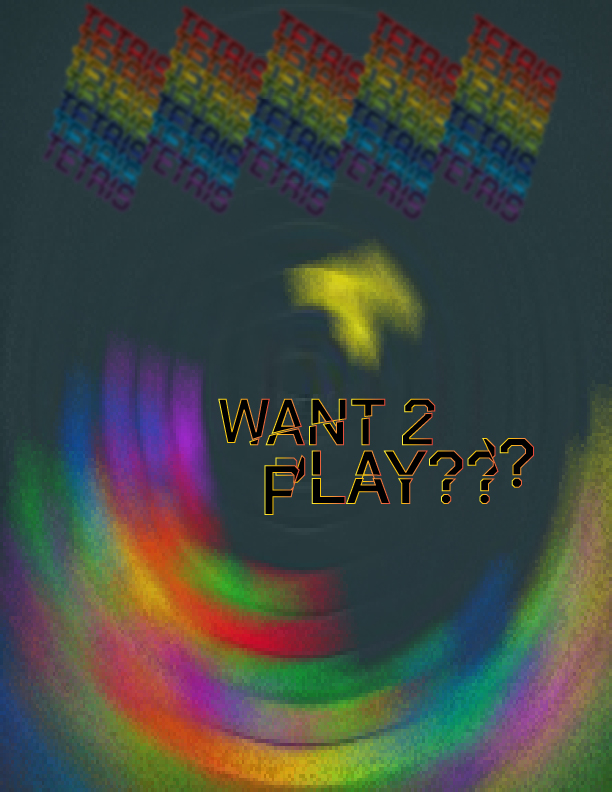
Illustrator: The Human Computer
Following Alice Min's directions to 'Blur, Slice, Tilt, then Play a Game', I reimagined a version of Tetris that embodies
the chaos and uncertainty of Alice's original composition. In this game, the board is rounded as opposed to flat, and the
pieces move too quickly for the user to be able to know where their new pieces are going. Featured in my representation is
sliced text, round blurring, and text manipulation. In my own composition, I wanted to play with name expression and the use
of the arc tool, and art brush.
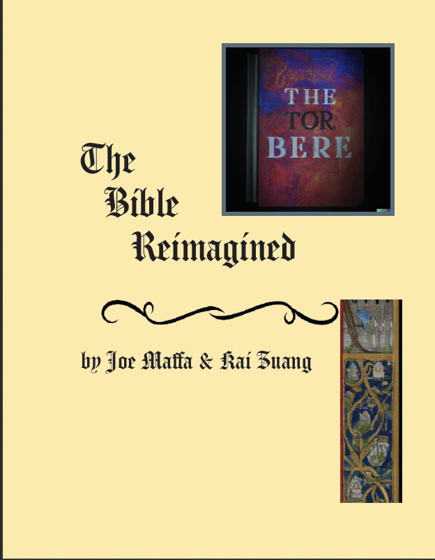
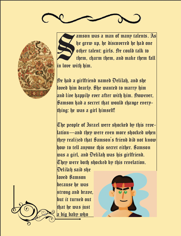
InDesign: AI&U
Given text generated by an AI and Kai Zuang's prompts, I reimagined stories from the Bible in the form of an illuminated
manuscript. I took inspiration from the decorative margins, aged pages, and elaborate type face. I also wanted to convery the
overwhelming feeling one may experience when they open up old books like this. The photos generated from the text are mostly
nonsensical, though they do seem to make the experience more modern.